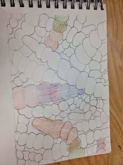
The design element that was stressed during this project was the radial design. I put my radial design on the inside of the bowl in a circular motion. The hump mold was my technique that I used to shape my ceramic piece. My piece does serve a function and at home my family uses it to put snacks and food in. It is very useful when it comes to holding and storing objects. The medium of my ceramics project is white clay. During my project I learned the different techniques you use while making a ceramic piece and I learned many different tools that you can use to make your piece evem better. If I were to repeat my project I would make it neater and make the radial design look the more of the same shape. I did enjoy making the bowl because it was fun learning all of the different ways to make your piece even better. I liked how I made my edges scalloped and then put more of an edgy design on the bowl. This piece was made out of white clay. I used slip to smooth out the edges and fill in the cracks. My piece was 13 inches wide and 5 inches tall.
Pastel Still Life

I planned the composition of my project by setting up many different positions to set up the candy and then I took a picture. Once I took the picture I would look at it and decide which position I liked the best. A thumbnail sketch is a small sketch where you draw a small pencil sketch that gives you an idea of what your final piece of art work is going to look like. I used a thumbnail sketch to help me decide where and how I wanted to place my objects. The viewfinder helped me decide on my composition by giving me a visual of what the objects would look like if they were set in a certain place. I liked how I stacked the candy and had candy spilling out of one of the bags. This gave my pastel a more realistic look. To make my items appear three dimensional I created shadows under the items and I made creases in the candy wrappers because that is what the items looked like in person. I created a light source by having Mrs. Brokke turn off the lights and then she turned on the spotlights. I used different values and shadows to display the light sources in my project. Overall I really enjoyed doing this project even though working with the pastels was a little frustrating.
Acrylic Landscape Painting
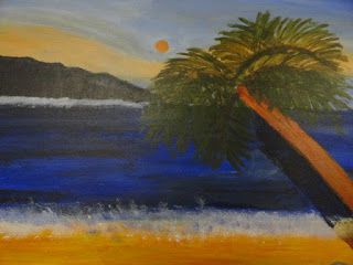
The process to creating my acrylic painting started by setting up my paints. We put the colors blue, yellow, red, white and black into cups and hot glued them onto a piece of cardboard. The colors blue, yellow, and red were used because they are the primary colors. White and black were used because they can help me change the values in my painting. Mrs. Brokke instructed us to pick the color scheme that we wanted for pur painting. I chose analogous and used the colors orange and blue. Next we each had to go to the arts and craft store to buy a canvas for our painting. After buying our canvas we cut out pictures for ideas of what we wanted our painting to look like. I chose beach themed pictures because I knew that was the them that I wanted my painting to have. Once we found our pictures we created a drawing with pen to give us an idea of what all of our painting was going to look like. I drew the lines in my drawing in certain directions depending on which was I was going to stroke my brush so that the picture would look more like the painting. Since I had an idea of what my painting was going to look like I decided that I was ready to start painting so we started to set up everything. We started by setting up our easels with newspaper underneath, we got our paints and paint brushes out of the cabinet, we got a cup of water, and put on our smocks. My next step was to start the sky so I spent a couple of class periods making our sky as best as I could. The reason we started with the sky was because the sky is the background to our whole painting. After the sky I started to paint the back ground image which in my painting was a mountain. Everyone in our class had a different background image. The background image is the object that is the farthest away in the painting besides the sky. After I painted the back ground image I started painting the ocean which took up most of the canvas and after the ocean I painted the sand. Finally, I painted the palm tree because I need to add more to my painting to make it look more interesting and in the pictures I cut out of the magazines they all had a palm tree in it. I orgainized my painting by looking at the pictures I cut out and putting pieces of each picture into my painting. Atmospheric perspective gives the painting a realistic feel. The objects in the background are not as clear as the objects in the front. I created this atmospheric perspective by creating fog by using a sponge and white paint on top of the sky and I added orange to the dark blue of the mountain to make the blue more dull so the mountain would pop as much as the other objects. I created a light source by making a sun close to the middle and then deciding where the sun would shine the most and where the shadows and darker parts would be. My color scheme was analogous using the colors orange and blue. I used horizontal and vertical brush strokes. I did use value in my painting by added darker and lighter colors to create different values in my painting. In my ocean the value changed because I made waves in my water and used the darker blue color.
Reverse Tie-Dying

The process of the "reverse tie-dying" project was to first find a 100% cotton black shirt. After everyone bought their shirt we started to create the design we wanted our shirt to look like. I wanted my shirt to have an ongoing design so I started by putting a golf ball in the bottom corner of my shirt and then I kept tying the string around my shirt. Between the ties I skipped about two inches because I wanted some of my shirt to stay black and the rest to change colors. After everyone in my class finished creating their designs we started by putting our shirt into bleach. I watched my shirt change colors in the bleach and then when I decided that I liked the color that it was turning I took it out of the bleach and put it in the vinegar. The reason we put it in the vinegar is because we wanted to stop the bleach from changing the color my shirt was into an even lighter color. After squeezing the vinegar out of my shirt I put it into the water to clear out the extra bleach and vinegar left in the shirt. Once I was done I started to cut the strings off of the shirt and then I took the gold ball out of the bottom corner. I hung my shirt up on a hanger and left it out on the fence to dry. I loved the way my design looked and I was very impressed by the way it turned out.
Shoe Drawing
This drawing was one of my favorite pieces in my portfolio. This project did not take very long to create but it was still fun. We started out by taking off our shoes and setting them up in a way that we would want to draw them. Mrs. Brokke told us that we needed to make the shoe that was farther away lighter than the show that is closer to you. My cowboy boots had lots of detail but it was fun to create the design. We had to draw a table top so it did not look like our shoes were floating in the air. Overall this project turned out really good in my opinion and I really enjoyed drawing it.